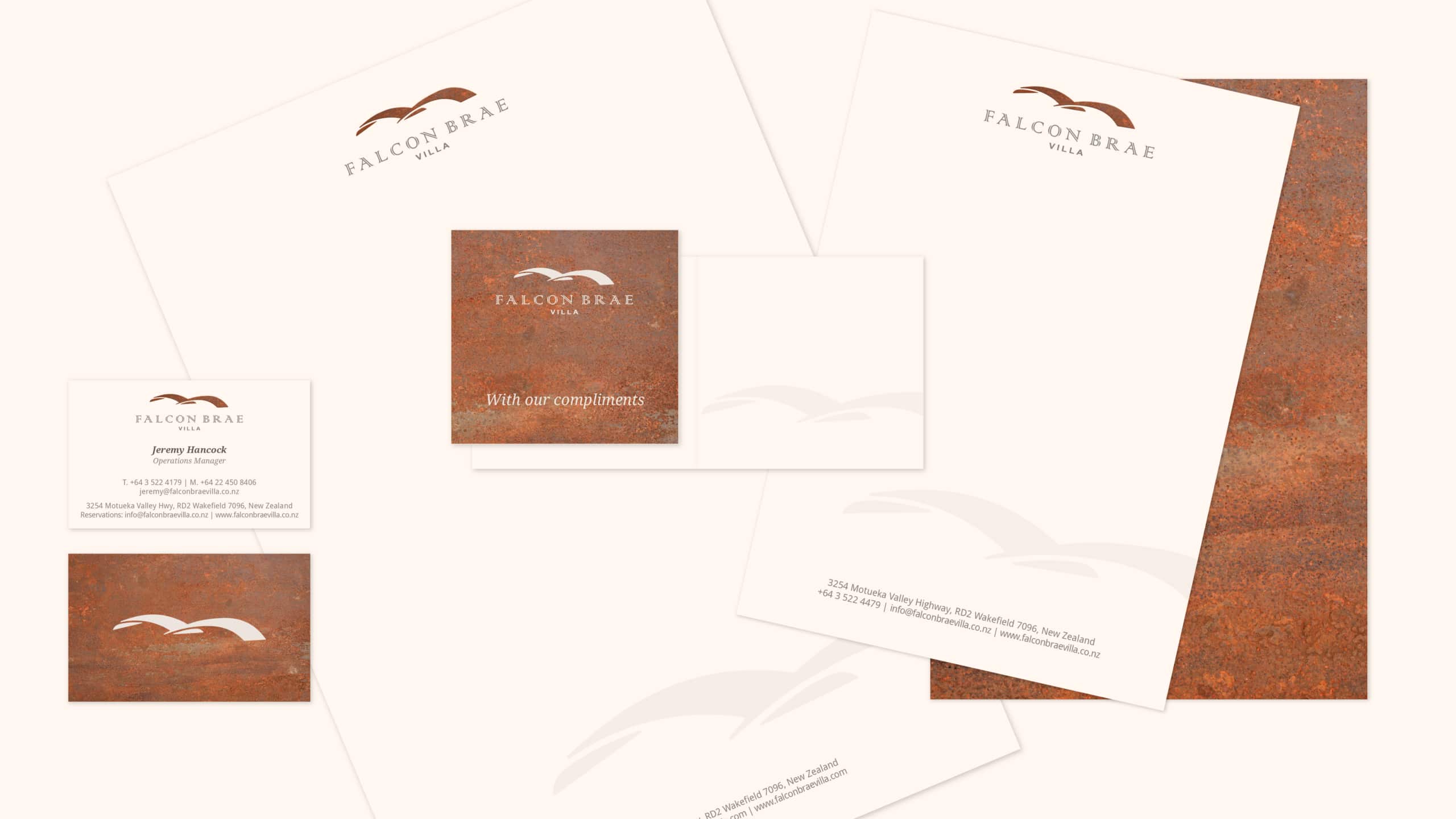
Jane was meeting with Stonefly Lodge when the owner was so impressed that he asked if she would be interested in working on a brand for a Villa he was managing for an American client. They had employed an agency that was unsuccessful in coming up with a brand that represented the luxuriousness of the offering. Challenged by the offer, Jane worked on the identity for Falcon Brae Villa.
The Villa is perched atop a steep hill (brae) above Stonefly Lodge, and local karearea (New Zealand falcon) often soared around the hillside. Jane drew on the architect’s falcon wing-inspired roofline and, in turn, used that to inspire a couple of her design options – one of which was the final logo choice.
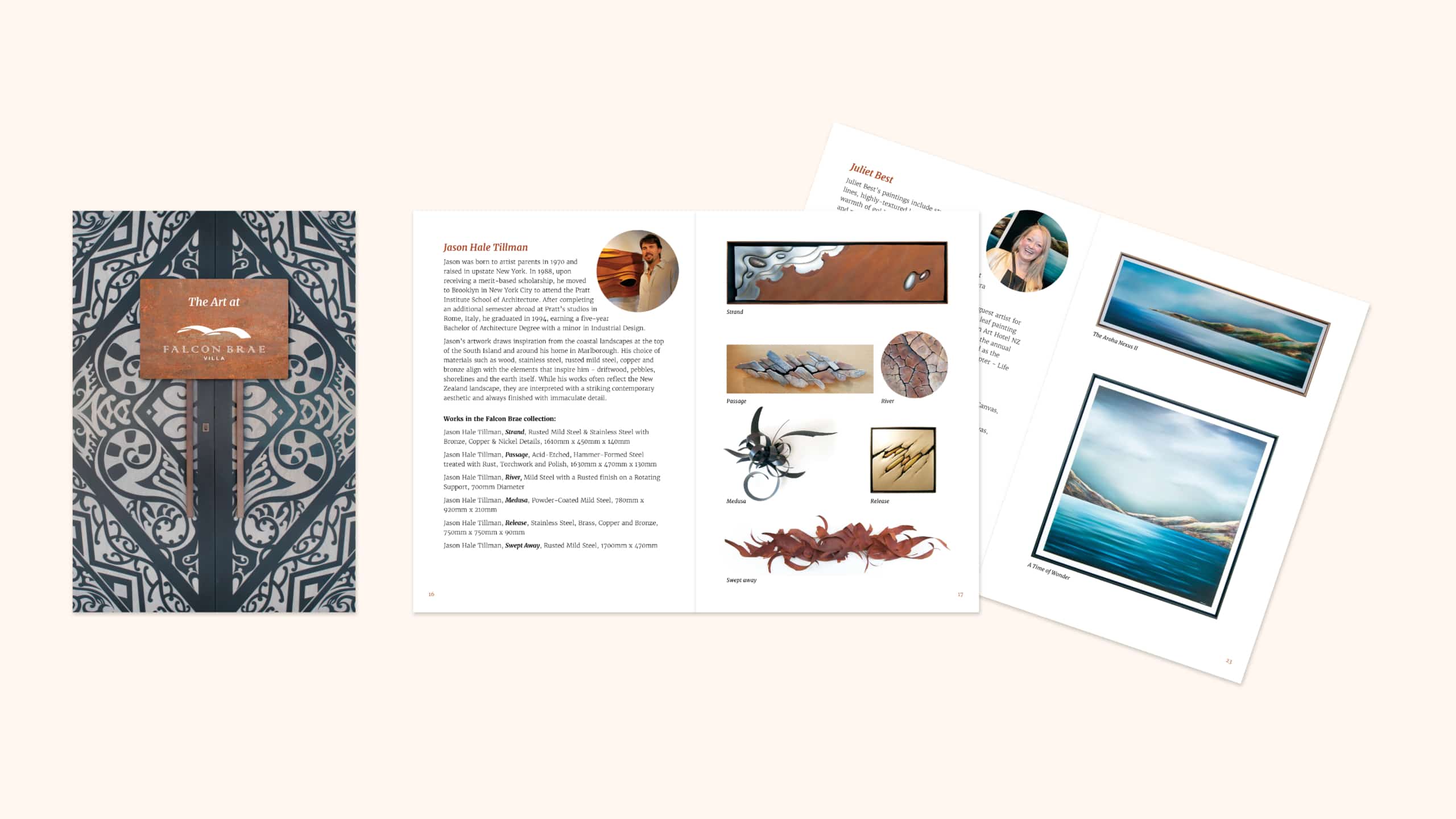
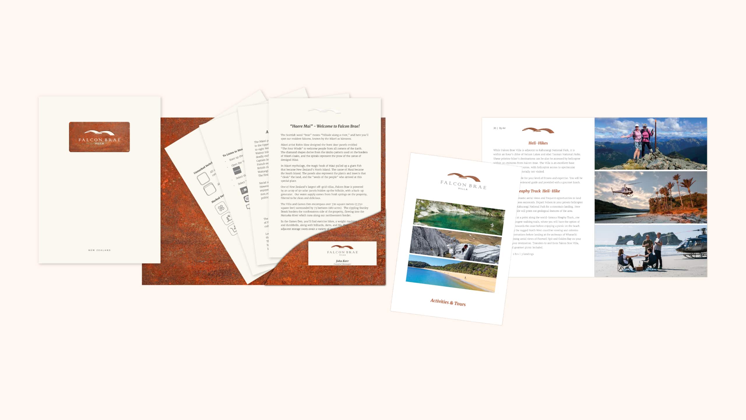
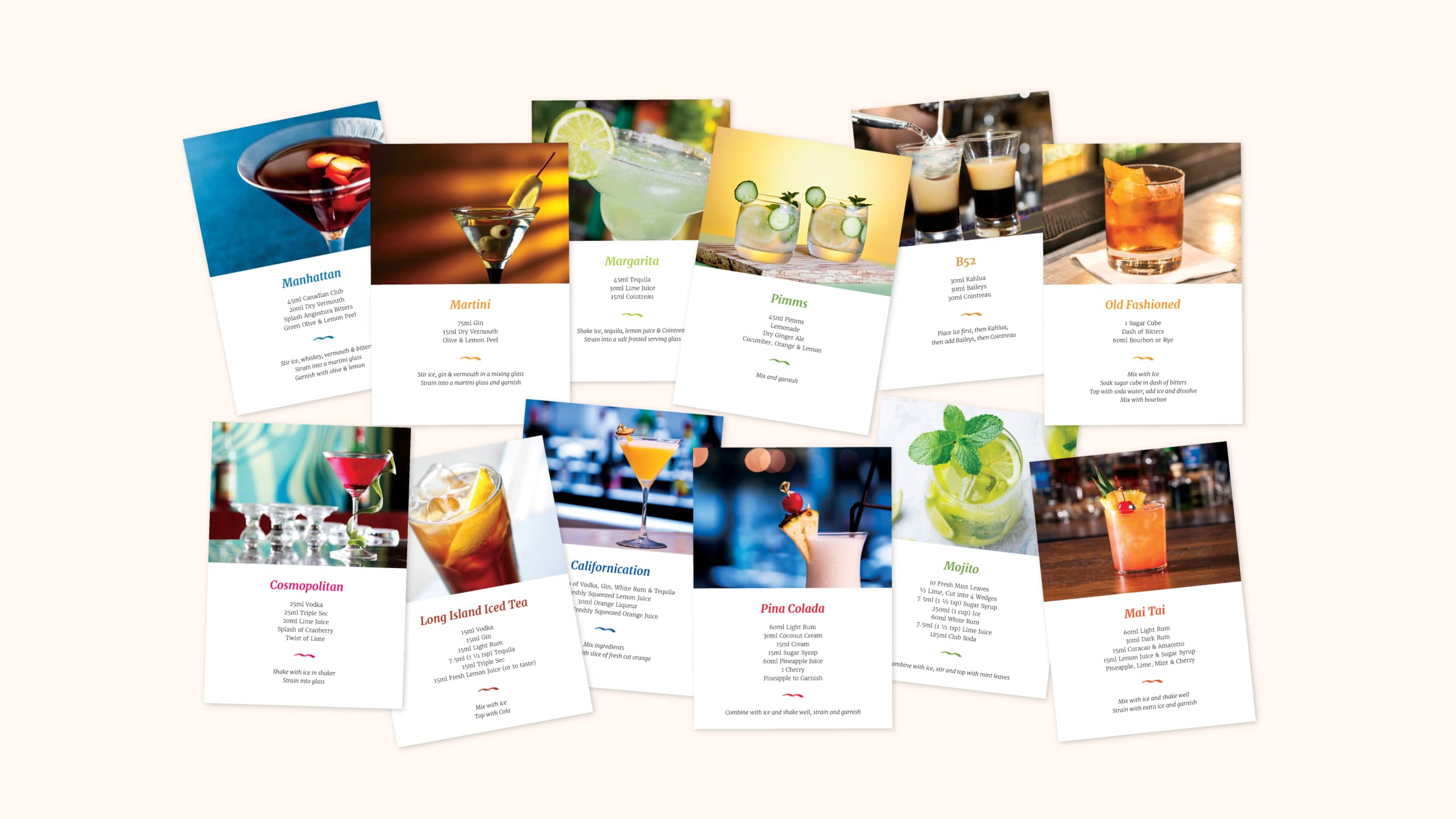
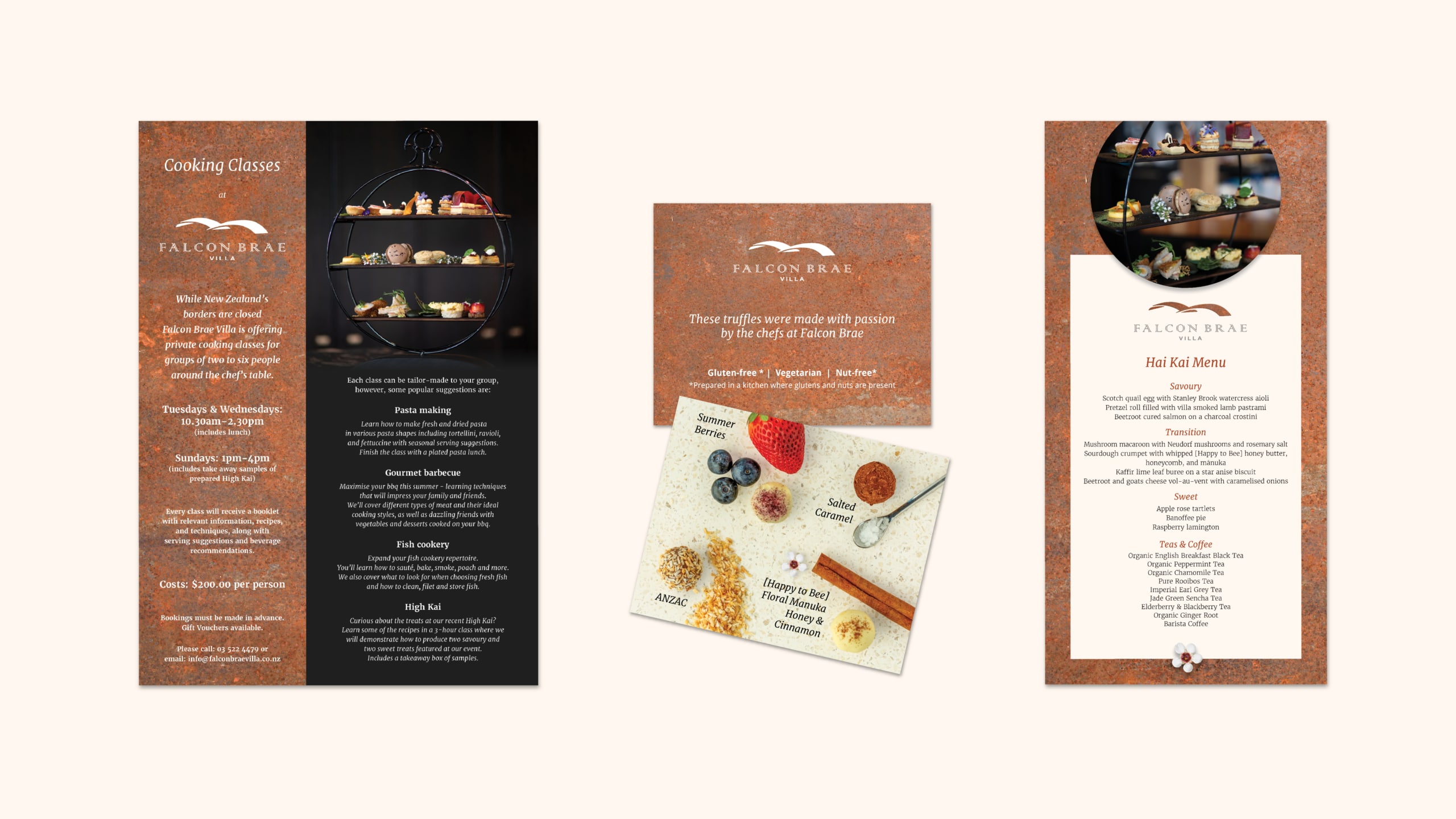
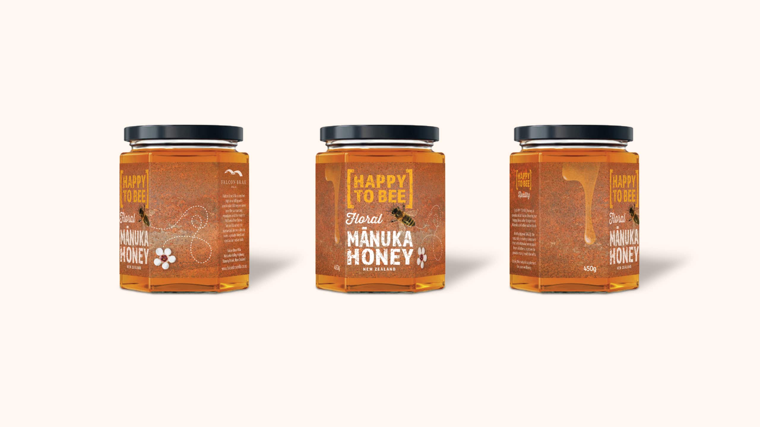
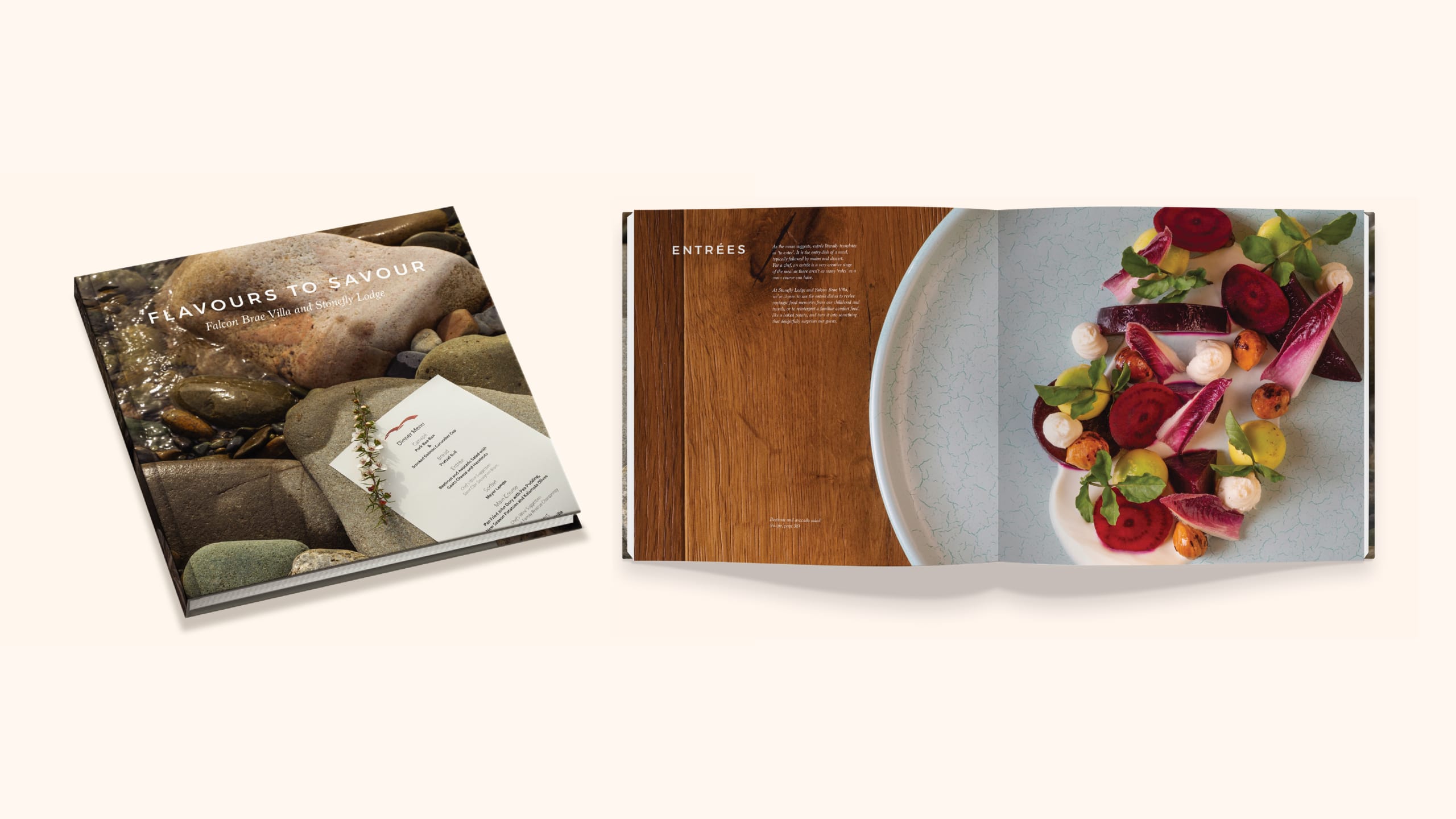
The collaboration with Falcon Brae Villa was a resounding success. Jane’s work extended beyond the brand, encompassing all marketing collateral and in-house material, including packaging for floral honey collected from hives on the property and the chef’s cookbook, featuring photography by Chocolate Dog Studio.